

 Build Your Dream Website – with Website Wala


Discover The Benefits of Using a Responsive Design Framework and how it improves user experience, SEO, scalability, and cross-device adaptability.
The Benefits of Using a Responsive Design Framework
In today’s digital-first world, websites must look and function flawlessly across all devices—from desktops and tablets to smartphones. This is where understanding The Benefits of Using a Responsive Design Framework becomes essential. A responsive design framework simplifies development, enhances user experience, and ensures optimal SEO performance by adapting seamlessly to different screen sizes.
In this article, we’ll explore The Benefits of Using a Responsive Design Framework, highlighting its key advantages in terms of usability, scalability, flexibility, and maintenance.
What Is a Responsive Design Framework?
Before diving into The Benefits of Using a Responsive Design Framework, it’s important to define what a responsive design framework actually is.
A responsive design framework is a pre-structured set of tools, stylesheets, and scripts that help developers build responsive web designs efficiently. It uses a grid system, media queries, and flexible components to ensure that a website automatically adjusts its layout and content based on the user’s device and screen resolution.
Popular frameworks such as Bootstrap, Foundation, and Tailwind CSS have made responsive development faster and more standardized. Instead of coding every element from scratch, developers can use predefined classes and modules that ensure consistent adaptability and usability.
The Core Benefits of Using a Responsive Design Framework
1. Enhanced User Experience
One of the most significant benefits of using a responsive design framework is the improved user experience. Whether visitors access a site from a laptop, tablet, or smartphone, a responsive layout ensures that navigation, readability, and functionality remain seamless.
With consistent usability across all screen sizes, users are more likely to stay longer and engage with your content. Smooth transitions between devices and intuitive design patterns foster accessibility and build trust with your audience.
2. Faster and More Efficient Development
Another of The Benefits of Using a Responsive Design Framework lies in the streamlined development process. Frameworks come with built-in grid systems, reusable components, and media queries, which significantly reduce coding time.
Developers can quickly assemble a responsive web design by customizing existing modules rather than building layouts from scratch. This not only speeds up development but also minimizes human error and ensures design consistency across pages.
3. Improved SEO and Search Engine Rankings
Search engines prioritize mobile-friendly and responsive web designs in their ranking algorithms. Therefore, one of The Benefits of Using a Responsive Design Framework is improved search engine rankings.
A responsive design enhances SEO by providing a single URL structure and consistent content across devices, reducing duplicate content issues. It also improves site speed and usability, two major factors that search engines consider for ranking.
By using a responsive framework, you inherently optimize for SEO, ensuring that your site performs well on both desktop and mobile searches.
4. Easier Maintenance and Scalability
When discussing The Benefits of Using a Responsive Design Framework, maintenance and scalability are vital factors. A single responsive design means you don’t have to manage separate versions of your website for different devices.
Any updates or design changes can be applied once and automatically reflected across all screen sizes. This unified approach reduces long-term maintenance costs and simplifies the process of scaling your site as it grows.
Additionally, responsive frameworks make it easier to integrate new features, ensuring your site remains flexible and adaptable to evolving technologies and user needs.
5. Consistent Design and Branding
A strong online presence requires consistent branding. A responsive design framework provides pre-defined design patterns, fonts, and layouts, ensuring visual consistency throughout your website.
This consistency improves brand recognition and helps build a professional, cohesive user experience. It’s one of The Benefits of Using a Responsive Design Framework that often gets overlooked but plays a key role in long-term digital success.
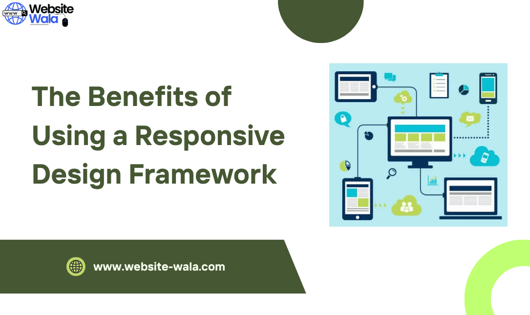
6. Adaptability Across All Devices
Adaptability is one of the core advantages of using a responsive framework. Websites built with frameworks automatically adjust to different screen sizes and devices, from wide desktop monitors to compact smartphone screens.
Through the use of media queries and a fluid grid system, content resizes and repositions itself without breaking the layout. This level of adaptability ensures that users always have an optimized experience, regardless of the device they use.
7. Enhanced Accessibility and Usability
A responsive framework ensures your website is accessible to users with varying abilities and devices. Features like scalable fonts, contrast control, and easy navigation enhance overall usability.
Among The Benefits of Using a Responsive Design Framework, accessibility stands out because it directly affects audience reach and inclusivity. By designing with accessibility in mind, businesses not only comply with standards but also improve overall user satisfaction.
8. Cost-Effectiveness
Building multiple versions of a website for different devices can be time-consuming and expensive. One of The Benefits of Using a Responsive Design Framework is cost efficiency.
With a single responsive web design, businesses save money on development and maintenance, while still reaching users across all platforms. This streamlined approach provides more value over time, especially for startups and small businesses operating on limited budgets.
9. Faster Page Loading Times
Responsive design frameworks are optimized for performance. They include lightweight CSS and JS components that improve page loading speed—an essential factor for both user experience and SEO.
Fast-loading pages reduce bounce rates and enhance engagement, directly contributing to better search engine rankings. Therefore, performance optimization is one of The Benefits of Using a Responsive Design Framework that delivers measurable results.
10. Future-Proof Design
Technology evolves rapidly, and websites must keep pace with new devices and screen sizes. By adopting a responsive design framework, your site becomes future-proof.
Frameworks are regularly updated to align with the latest responsive web design standards, ensuring continued compatibility, flexibility, and adaptability. This proactive approach minimizes redesign efforts and keeps your website relevant for years to come.
Conclusion: Why You Should Embrace a Responsive Design Framework
To summarize, The Benefits of Using a Responsive Design Framework extend far beyond visual appeal. From improved user experience and SEO to simplified maintenance and enhanced scalability, the advantages are numerous and tangible.
Incorporating a responsive framework into your web development strategy ensures that your website is mobile-friendly, accessible, and optimized for all devices. Whether you’re a developer, designer, or business owner, understanding The Benefits of Using a Responsive Design Framework is crucial for building a strong, adaptable online presence that meets the expectations of today’s users.


