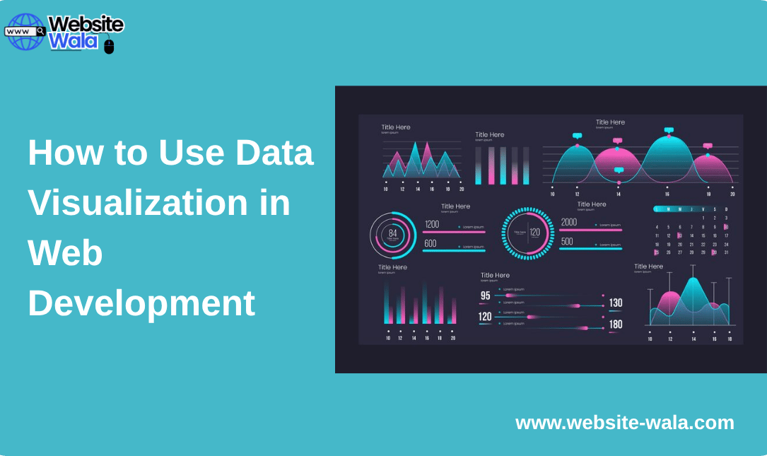
Learn How to Use Data Visualization in Web Development to create interactive, data-driven web designs that improve user experience and engagement.
Introduction: Why Data Visualization Matters in Web Development
In today’s digital landscape, websites are more than just static pages—they’re powerful tools for communication, interaction, and storytelling. One of the most effective ways to enhance a website’s impact is through data visualization. Understanding How to Use Data Visualization in Web Development allows developers and designers to transform raw data into meaningful insights that users can easily interpret. Whether you’re building dashboards, analytics tools, or interactive reports, visual data representation can significantly improve user engagement and comprehension.
What Is Data Visualization?
Data visualization refers to the graphical representation of information and data. Using visual elements like charts, graphs, maps, and infographics, data visualization makes complex information more accessible and understandable. In web development, it helps present data analysis results in a format that users can quickly interpret, enabling better decision-making and engagement.
When you understand How to Use Data Visualization in Web Development, you bridge the gap between technical data and human understanding. It turns abstract numbers into visuals that tell a story—making your website not only functional but insightful.
The Role of Data Visualization in Modern Web Development
Data visualization has become a cornerstone of data-driven web design. Modern users expect more than static text—they want interactive, informative, and visually appealing experiences. By learning How to Use Data Visualization in Web Development, you can create interfaces that display real-time data, enhance storytelling, and simplify complex information.
Some common applications include:
-
Dashboards: Presenting business metrics, analytics, or user activity.
-
Reports: Displaying sales trends, performance charts, or survey results.
-
Interactive maps: Visualizing geographic or demographic data.
-
Infographics: Enhancing content marketing with visual storytelling.
Integrating data visualization tools effectively helps developers adhere to web development best practices by improving accessibility, usability, and engagement.
Benefits of Using Data Visualization in Web Development
Learning How to Use Data Visualization in Web Development provides numerous advantages for both developers and end-users. Here are some of the key benefits:
-
Improved User Experience:
Visuals make it easier for users to grasp complex data at a glance. This aligns with modern information design principles, making data both functional and appealing. -
Enhanced Engagement:
Interactive data visualization encourages users to explore information more deeply, increasing time spent on the website and user satisfaction. -
Better Decision-Making:
When users can visualize patterns and trends, they can make informed decisions quickly—especially in dashboards and analytics tools. -
Data-Driven Storytelling:
Visuals can tell compelling stories backed by real data. This approach strengthens content marketing and product communication strategies. -
Real-Time Insights:
Many JavaScript libraries allow developers to visualize real-time data streams, keeping users informed with the latest updates.
How to Use Data Visualization in Web Development: A Step-by-Step Approach
Let’s explore a structured approach to How to Use Data Visualization in Web Development, ensuring your implementation is both effective and visually compelling.
Step 1: Define Your Goals
Before integrating visuals, clarify what story your data should tell. Are you showing growth trends, comparing performance, or monitoring live activity? Clear goals guide your information design and tool selection.
Step 2: Choose the Right Data Visualization Tools
Choosing suitable data visualization tools is crucial. Popular JavaScript libraries include:
-
D3.js: Highly customizable and ideal for complex data structures.
-
Chart.js: Great for simple, responsive charts and graphs.
-
Plotly.js: Perfect for interactive and scientific visualizations.
-
Google Charts: Easy to use and integrates seamlessly with Google Sheets.
Each tool offers unique strengths depending on your web development needs.
Step 3: Prepare and Analyze Your Data
Accurate data analysis ensures your visualizations are meaningful. Clean your data, remove inconsistencies, and organize it logically. Use APIs, databases, or CSV files as your data sources. Reliable input data is the foundation of any successful visualization.
Step 4: Design for Clarity and Accessibility
Information design focuses on making visuals intuitive and accessible. Follow these web development best practices:
-
Use contrasting colors for readability.
-
Include labels, legends, and tooltips for context.
-
Ensure charts are mobile-responsive.
-
Provide alternative text for accessibility compliance.
Step 5: Implement Interactive Data Visualization
Interactive elements make your visuals dynamic. You can use hover effects, zoom functions, or filters to allow users to explore data. Interactive data visualization keeps users engaged and provides deeper insights.
Step 6: Optimize Performance
Visual elements can affect load times. Optimize by minimizing scripts, using asynchronous data loading, and leveraging caching. Well-optimized data visuals maintain a smooth user experience without compromising performance.
Step 7: Test and Refine
Before deployment, test your visualizations across devices and browsers. Ensure responsiveness, readability, and functionality. Collect user feedback to refine the experience.
Examples of Data Visualization in Web Development
To understand How to Use Data Visualization in Web Development practically, let’s consider a few examples:
-
E-commerce Dashboards:
Show sales, conversions, and customer behavior through charts and graphs, helping businesses make data-driven decisions. -
Financial Applications:
Display stock trends, portfolio performance, and real-time market updates using interactive charts. -
Health and Fitness Platforms:
Present activity tracking data—like steps, calories, and heart rate—through visual progress indicators. -
Educational Platforms:
Use visual aids for quizzes, performance analytics, or learning progress dashboards.
Each of these examples uses data visualization tools and JavaScript libraries to transform static data into interactive insights, aligning perfectly with data-driven web design principles.
Web Development Best Practices for Effective Data Visualization
Implementing How to Use Data Visualization in Web Development successfully requires attention to best practices. Consider the following:
-
Keep It Simple: Avoid cluttered designs. Simplicity enhances understanding.
-
Be Consistent: Use consistent color schemes and styles for related data.
-
Prioritize Accuracy: Misleading visuals can harm credibility.
-
Ensure Responsiveness: Design visuals that adjust gracefully to various screen sizes.
-
Enhance Interactivity: Allow users to manipulate or filter data for personalized insights.
Following these web development best practices ensures your visuals remain effective, accessible, and user-friendly.
Future of Data Visualization in Web Development
The future of data visualization is increasingly tied to technologies like AI and machine learning. Developers are now building intelligent dashboards that automatically generate insights from real-time data. As you learn How to Use Data Visualization in Web Development, embracing these trends will keep your projects relevant and forward-thinking.
Augmented reality (AR), virtual reality (VR), and 3D visualization are also gaining momentum, offering immersive ways to experience data in the digital space.
Conclusion: Harnessing the Power of Data Visualization in Web Design
Mastering How to Use Data Visualization in Web Development is essential for creating engaging, data-driven websites that inform, inspire, and captivate users. From selecting the right data visualization tools to following web development best practices, every step contributes to crafting meaningful visual experiences.
By combining data analysis, information design, and modern JavaScript libraries, you can transform static data into interactive stories that add real value to your web projects. Data visualization isn’t just a design trend—it’s a strategic approach to making information accessible and impactful in the digital world.