

 Build Your Dream Website – with Website Wala


Learn How to Use CSS Grid and Flexbox for Layouts to create modern, responsive web designs. Master these CSS techniques for better layouts today!
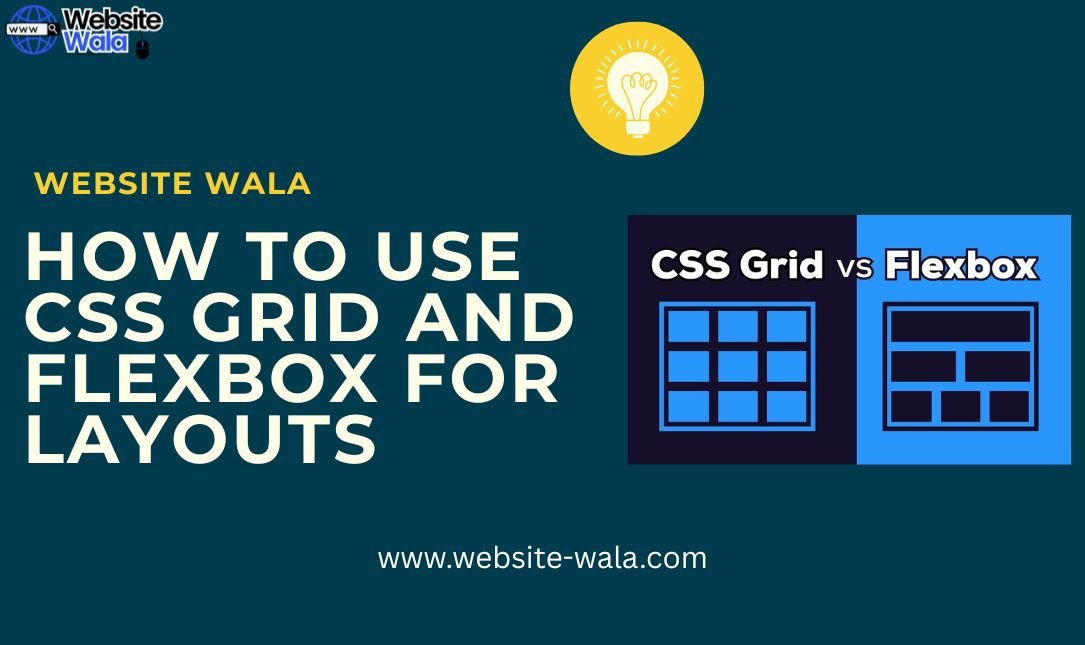
How to Use CSS Grid and Flexbox for Layouts
Modern web development demands flexibility, responsiveness, and clean structure. Understanding How to Use CSS Grid and Flexbox for Layouts is essential for building professional, user-friendly, and adaptable designs. These two powerful CSS techniques simplify web layout creation, enabling developers to build complex website designs that adjust gracefully to any screen size.
In this guide, we’ll break down the fundamentals of CSS Grid and Flexbox, show how to combine them effectively, and share web design tips for achieving beautiful, responsive designs.
1. Introduction to CSS Grid and Flexbox
Before diving into How to Use CSS Grid and Flexbox for Layouts, it’s important to understand what each tool offers.
What Is CSS Grid?
CSS Grid is a two-dimensional grid system that allows you to control both rows and columns simultaneously. It’s perfect for creating overall page layouts, gallery structures, and dashboard designs. With CSS Grid, you can position elements precisely, ensuring that your web layout remains consistent across devices.
Example:
.container { display: grid; grid-template-columns: repeat(3, 1fr); gap: 20px; }
This simple snippet creates a three-column CSS grid layout with equal-width columns and consistent spacing.
What Is Flexbox?
Flexbox, short for the Flexible Box Layout, is a one-dimensional CSS technique that excels at aligning elements horizontally or vertically within a container. It’s great for navigation bars, content boxes, and aligning items neatly.
Example:
.navbar { display: flex; justify-content: space-between; align-items: center; }
With just a few lines of code, Flexbox makes it easy to build clean, adaptive navigation menus.
2. Why Learn How to Use CSS Grid and Flexbox for Layouts?
Learning How to Use CSS Grid and Flexbox for Layouts is a crucial skill in modern frontend development. These tools not only make coding easier but also enhance the responsive web design process.
Here’s why you should use both:
-
CSS Grid is perfect for large-scale page structures.
-
Flexbox is ideal for aligning smaller groups of elements within those structures.
-
Combining both creates a dynamic layout that adapts to different screen sizes effortlessly.
When used together, they offer a complete system for website design that’s both flexible and maintainable.
3. When to Use CSS Grid vs. Flexbox
Understanding when to use each layout method is a key part of How to Use CSS Grid and Flexbox for Layouts effectively.
| Scenario | Use CSS Grid | Use Flexbox |
|---|---|---|
| Full page or section layouts | ✅ Yes | ❌ No |
| Aligning items in one direction | ❌ No | ✅ Yes |
| Complex grid-based designs | ✅ Yes | ❌ No |
| Small components (e.g., navbars, buttons) | ❌ No | ✅ Yes |
In short, use CSS Grid for overall web layout and Flexbox for fine-tuning the inner alignment.
4. Creating a Basic Web Layout Using CSS Grid
Let’s look at a practical example that demonstrates How to Use CSS Grid and Flexbox for Layouts in web development.
Here’s a simple CSS grid layout for a webpage:
<div class="grid-container"> <header>Header</header> <nav>Navigation</nav> <main>Main Content</main> <aside>Sidebar</aside> <footer>Footer</footer> </div>
.grid-container { display: grid; grid-template-areas: "header header" "nav main" "nav aside" "footer footer"; grid-template-columns: 1fr 3fr; grid-gap: 20px; }
Each section is easily arranged using grid areas. This setup forms the foundation of many responsive designs and website layouts.
5. Enhancing the Layout with Flexbox
Once the grid structure is in place, Flexbox can fine-tune elements inside individual sections. For instance, aligning items in the navigation bar:
nav { display: flex; justify-content: space-around; align-items: center; }
This approach ensures that navigation links or buttons are evenly spaced and responsive. Using Flexbox within a CSS Grid structure is a core strategy in How to Use CSS Grid and Flexbox for Layouts effectively.
6. Making It Responsive
Responsive web design is a must in modern frontend development. Thankfully, both CSS Grid and Flexbox are inherently responsive. You can adjust the grid system or flex direction based on screen size using media queries:
@media (max-width: 768px) { .grid-container { grid-template-columns: 1fr; grid-template-areas: "header" "nav" "main" "aside" "footer"; } }
This ensures your web layout automatically adapts to tablets and smartphones — a fundamental principle of responsive design.
7. Combining CSS Grid and Flexbox for Dynamic Layouts
The real power of How to Use CSS Grid and Flexbox for Layouts lies in combining both for dynamic layouts. You might use CSS Grid for the page’s skeleton and Flexbox for precise internal alignment.
Example:
-
Use CSS Grid for arranging the header, sidebar, content, and footer.
-
Use Flexbox inside the header for aligning logos and navigation items.
This hybrid approach creates adaptable, elegant, and efficient website designs that scale across devices.
8. Common Mistakes and Web Design Tips
Even experienced developers can make mistakes when learning How to Use CSS Grid and Flexbox for Layouts. Avoid these pitfalls:
-
Overcomplicating the grid: Keep grid structures simple and readable.
-
Mixing too many display types: Use either grid or flex for each container, not both simultaneously.
-
Ignoring browser support: Always test your web layout on multiple browsers.
-
Not using
gap: Replace margin hacks with the moderngapproperty in both CSS Grid and Flexbox.
Web design tips: Plan your layout visually before coding, use grid templates for consistency, and rely on CSS variables for easy customization.
9. Real-World Applications
Learning How to Use CSS Grid and Flexbox for Layouts enables developers to create:
-
Responsive dashboards and portfolios
-
Flexible landing pages
-
Adaptive eCommerce product grids
-
Clean blog post templates
-
Dynamic gallery layouts
These applications showcase the versatility of CSS techniques in real-world web development projects.
10. Conclusion
Mastering How to Use CSS Grid and Flexbox for Layouts is an essential step toward becoming a proficient front-end developer. CSS Grid provides a robust grid system for structuring layouts, while Flexbox excels at alignment and spacing within components.
By combining both, you can create responsive web designs that look professional and function seamlessly across all devices. Whether you’re learning through design tutorials or experimenting on your own, understanding How to Use CSS Grid and Flexbox for Layouts will elevate your web development skills and streamline your workflow.


